This week’s prompt from Top Ten Tuesday is another cover-based one, about covers featuring handwriting/fonts that look like handwriting. I don’t actually know what I’ll find, but let’s see!
Aaand the end results are a bit of a mix: mostly I kept finding the same sort of “handwriting-ish” fonts being used, the “I’m based ultimately on handwriting/calligraphy, but everyone’s used to this as a font” ones. But here are some that caught my eye, narrowed down from about twenty…
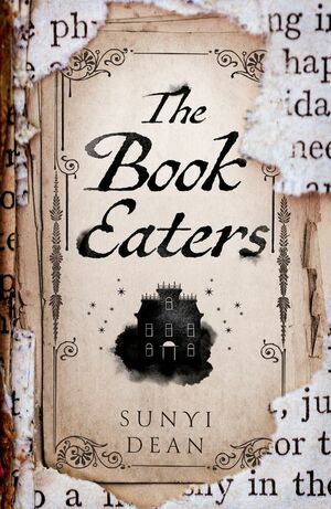
I didn’t love all these books (and I haven’t finished The Book Eaters yet), but I confess that handwriting fonts do seem to grab my attention, and I definitely like them a lot when I’m making graphics (on the rare occasions that I do). Amsterdam Three, how I love thee.

I love the Amsterdam font set too!
Thanks for sharing your #TTT
Shelleyrae @ Book’d Out recently posted…Top Ten Tuesday: Books with Handwriting on the Cover
I came across it on Canva initially and I just love it…
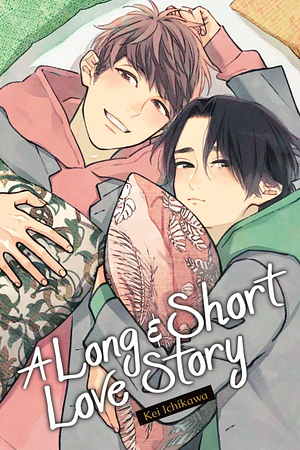
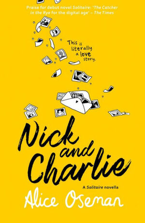
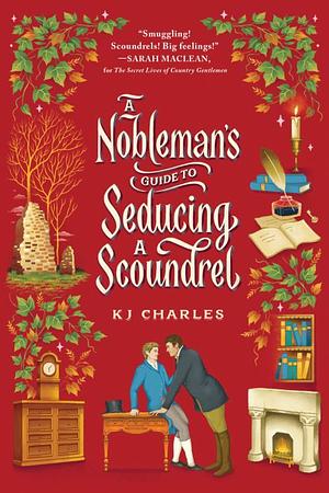
Nick and Charlie has a nice font.
Lydia recently posted…Top Ten Tuesday: Books with Handwriting on the Cover
Yeah, it’s a nice look, and suits the story!
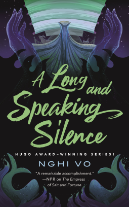
Love those Nghi Vo covers.
Yeaaah, I nearly picked more than one, haha.
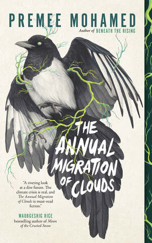
Great choices! I’m really into the thick fonts like the one on The Annual Migration of Clouds for some reason
Yes! I don’t have much of anywhere to use them but I definitely enjoy how they look.
Excellent choices! I’m a sucker for a pretty font and a pretty or intriguing cover. The Book Eaters. for example, has me curious.
Olivia recently posted…Top Ten Books With Handwriting in the Title
I’ve been trying to read The Book Eaters lately, but I’m just not getting into it as much as I’d hoped.
They are pretty covers. I rarely take any notice of the title font so it was good to really look at the covers.
Yeah, I like these prompts to take a closer look at covers!
It generally surprises me what I find
100%, I’ve had fun leaning into these prompts lately.
Same!
I haven’t read any of these, but these are great covers. Great choices.
Yvonne @ Socrates Book Reviews recently posted…Spotlight: The Black Cat Detectives: A Mystery by Kit Gray (Blog Tour/Tour-Wide Giveaway)
Thanks for dropping by!
I’m was almost surprised “Copper Script” didn’t make the cut, but the presence of multiple lower case “p”s make it look too much like a font and not handwriting, even if it is based on copperplate.
HarpGriffin recently posted…Delayed? Post but at least I’m not sick!
Yeah, I did consider including it but it did look very fonty… more so than I’d remembered. Shame!
I haven’t read Nick and Charlie but I love them in the Heartstopper books! I was so surprised to learn that Nick and Charlie was written before the Heartstopper books. I also recently just added the Premee Mohamed book to my TBR, I still have yet to read The Butcher of the Forest though.
Haze @ The Book Haze recently posted…Top Ten Tuesday | Books with Handwriting on the Cover
Yeah, I think because people thought they were cute when mentioned in one of her other books? Which I haven’t read myself!