This week’s Top Ten Tuesday prompt is about interesting cover typography… which is a tricky topic for me, because I’m a very non-visual person! That said, it also sounds fun, so let’s see what I can do.
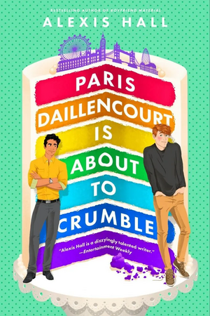

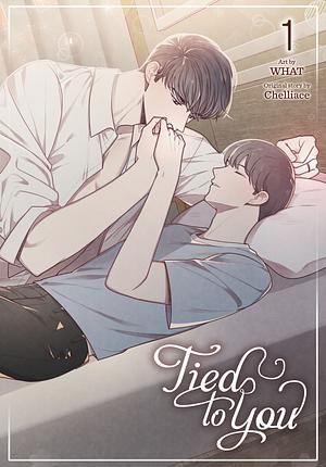
I make no promises about the quality of the books, because I’ve only read four of them and only loved two. All the same, these covers jumped out at me as doing interesting things with the typography (like following the layers of the cake, the echoed upside-down A, the letters of Tied to You being tied together, the broken crime-scene tape).
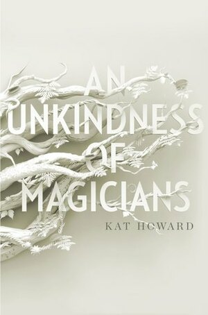
For my money, the coolest is An Unkindness of Magicians, though: it’s a pretty plain font, but somehow it’s making that pale-on-pale look work, and the branches are growing into the letters… a lot of the time bright colours draw the eye, but this cover draws the eye by eschewing colour, including in the title text.
I’m very curious to see what others have unearthed, and what other people feel looks cool!
ETA: See also my post today about the importance of book covers!

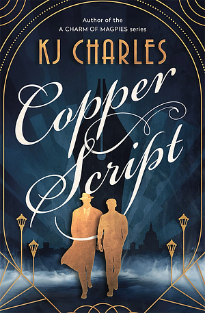
I really loved Paris Daillencourt, and Copper Script is on my TBR ❤️ Lots of gorgeous covers!
Louise @ Foxes and Fairy Tales recently posted…Top Ten Book Covers Featuring Typography
I really need to get round to Paris Daillencourt is About To Crumble — I had fun with the previous book!
When a book has an amazing cover that has been cleverly planned out, I tend to expect the same from the story.
Deb Nance at Readerbuzz recently posted…Book Covers with Cool Typography
Sometimes it can be disappointing, sadly… but it can be a good sign for a really solid team behind the book!
Copper Script has such pretty typography.
Yes! And it’s relevant to the story too…
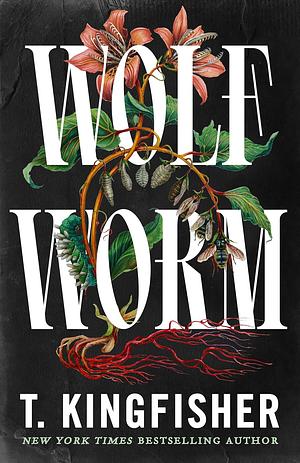
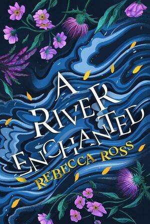
These are great examples! I like the way a bunch of your choices have the letters weaving in and out with other elements in the cover. Like A River Enchanted and Wolf Worm.
Yeah, I hadn’t actually noticed A River Enchanted before somehow? And then I was looking at my saved book covers having a think and realised — the letters are in the water!
so cool!
I didn’t have enough titles to display, so I did top 5 instead: https://wordsandpeace.com/2026/02/03/top-five-series-i-plan-on-finishing-reading-in-2026/
Emma @ Words And Peace recently posted…Top Five Series I plan on finishing/reading in 2026
I was worried I wouldn’t be able to come up with enough too, ahaha. Spent quite a while gazing at my TBR. XD
I can’t wait to read Wolf Worm. Great picks this week!
I have an eARC and I want to get to it this month! T. Kingfisher’s books are usually so fun.
I knew you would find some very unique examples. The River Enchanted typography is very river-y!
Yeah, I hadn’t originally noticed and then I took a closer look! It’s a really nice effect.
I really like Radiant Black, and it seems to suit the book.
Thanks for sharing your #TTT
Shelleyrae @ Book’d Out recently posted…Top Ten Tuesday: Typography
It’s a pretty good cover for it, yeah! The story wasn’t so much for me, but as a comic book logo/title the design is great.
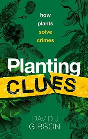
Planting Clues has QUITE the subtitle! I’ll have to look for that one!
The subtitle totally makes me imagine little Sherlock Holmes plants, I must admit. (Sadly it’s more how botany can help solve crimes, but it was reasonably interesting too.)
These are really nice covers. My favorite would be A River Enchanted, but they are all really great.
Yvonne @ Socrates Book Reviews recently posted…Top Ten Tuesday – Book Covers Featuring Cool/Pretty/Unique/etc. Typography
Yeah, A River Enchanted‘s cover has really grown on me now I’ve noticed that watery effect on the letters!
Somehow, Copper Script looks exactly how I think a copper script might look! These are all great though.
Here is our Top Ten Tuesday. Thank you!
I think it is actually copperplate script specifically! Though I don’t know for sure, it’d make sense, haha.
Great choices here. I love typography!
Carol @ ReadingLadies recently posted…10 Diverse Reads for #BlackHistoryMonth #blogger #bookblogger #bookx #booksky #TopTenTuesday #TuesdayBookBlog #DiverseReads #AuthorsOfColor #BookList
I did find some nice ones, despite not paying a lot of attention to covers most of the time, ahaha. Surprised myself!
I agree that An Unkindness of Magicians is very cool! I do also like the Paris Daillencourt one, even if it’s totally different 🙂
Lindsey @ Lindsey Reads recently posted…Book Covers Featuring Cool Typography
Yeah, the one with the cake really pops!
Rebecca’s is really pretty and cool looking! That that one. 🙂 Thanks so much for visiting my list today.
Yeah, it’s a really cool design. I’m glad I looked closer at it and realised that the letters were “in the water” too, I hadn’t registered that detail at all.
I love the way the letters fit onto the layers of the cake, too! Looks very cool.
Yeaaah, and the bright colours make the lettering pop, too.
I especially like the cover of A River Enchanted. Have a good week!
Cindy’s Book Corner recently posted…TTT-the typography has it
That one seems to be quite the favourite among my comments this week!
I feel like T. Kingfisher’s books always have amazing covers!
I had an older (self-published?) version of Clockwork Boys which I found less cool, but the UK versions that have been released lately are really great.
An Unkindness of Magicians looks…. magical. They did a great job on that one!
Right?! It really caught my eye as I was looking for examples. I kinda wish I had a physical copy.
I think you did a fantastic job of finding covers this week.
Pam @ Read! Bake! Create!
https://readbakecreate.com/the-ss-have-it-ten-titles-starting-with-s/
Thanks!
I completely forgot about A River Enchanted, that is a gorgeous cover! And I agree about the cover for An Unkindness of Magicians, it really catches the eye with how stark it looks!
Haze @ The Book Haze recently posted…Top Ten Tuesday | Books Covers with Interesting Typography
I hadn’t looked closely at either of those covers before, but I really like them.
The color scheme for An Unkindness of Magicians does feel out of place, but in a really good way. I think the shadows behind the branches really adds to the composition. Great picks!
Yeah, it really makes it stand out!
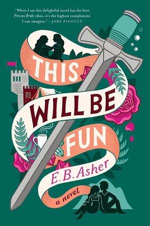
Great choices! I really like the cover/typography of This Will Be Fun.
Yeah, it looks… well… fun, haha!
The Kingfisher cover is awesome!
A lot of her book covers lately have been amazing, especially the recent UK versions!
Are you sure you’re a nonvisual person? These are great choices. This Will Be Fun is my favorite, but Planting Clues is a close second.
Olivia recently posted…Review of Unthinkable by Helen Thomson
Very sure! I am in fact completely aphantasic, so I have no “mind’s eye” at all, and am completely unable to picture anything or have visual memories. It can be quite the limitation in visual tasks like comparing two images — I have to describe them to myself if I need to remember details, like a list of the image contents.
You picked some great covers! My favorite is the one for THE RIVER ENCHANTED.
Happy TTT (on a Wednesday)!
Susan
http://www.blogginboutbooks.com
That seems to be a favourite for a lot of people in the comments here! It’s a really nice effect.