After the Top Ten Tuesday prompt about interesting typography this week (check out my post if you’re curious), I saw a few people commenting that they don’t even look at book covers, “don’t judge a book by its cover”, “book covers don’t matter”, etc. And there’s a sense in which this is true — I’ve read some books with truly awful covers, really plain covers, etc. I’m not a visual person, so I don’t find covers particularly memorable, in general. I often describe them simply, just by the title and name of the author, because once a book is in my hands I don’t think an awful lot about it.
However, I think it’s a bit rash to dismiss book covers entirely! They’re serving an important purpose: they help the right people find the book, in a number of different ways, starting as simply as “by having the author’s name and title on the cover”.
(I’m going to discuss some examples below: unfortunately they’re all pretty visual, because cover design is — but I’ve made an effort to add more descriptive alt text than I usually use, since the purpose of these cover images is to illustrate a point.)
Consider the British Library Crime Classics books: they’ve got a cohesive design principle, all based on old travel posters, so you know immediately when seeing one on a shelf what it is. You’re gonna get a classic British mystery, with traditional crime/mystery elements, with a helpful introduction (usually by the series editor, Martin Edwards), which contextualises the story a bit in terms of who the author was, any other pen-names they used (particularly useful with writers like E.C.R. Lorac/Carol Carnac, Miles Burton/John Rhodes/Cecil Street, Francis Iles/Anthony Berkeley, etc), etc.
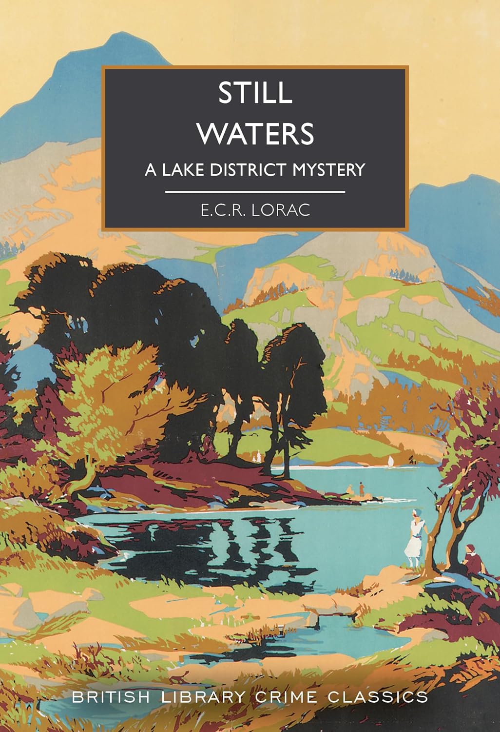

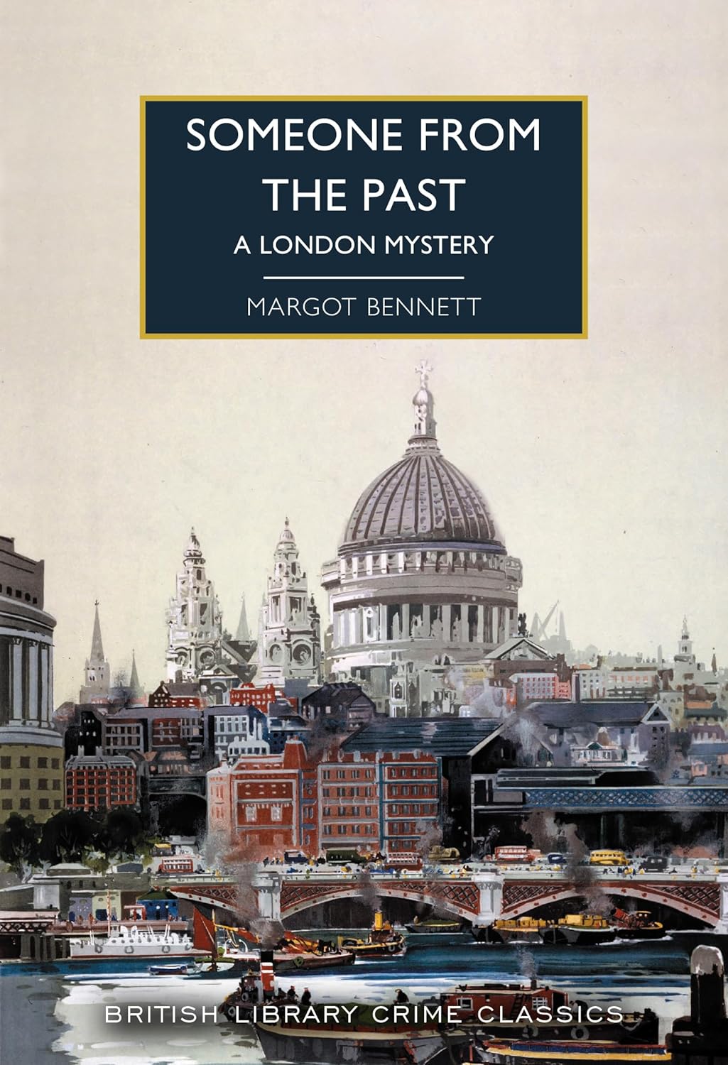
They’re so iconic that they even get copied by others in the genre. Some of those I’ve seen have just been modern pastiches of the Golden Age style, which I admittedly find a bit annoying because it’s misleading, while others are classic authors who haven’t been picked up (yet?) by the British Library Crime Classic series for one reason or another.
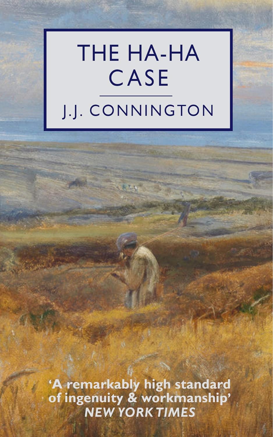
I enjoyed The Ha-Ha Case, as I recall, in much the same way as I enjoy most of the British Library Crime Classics: it’s a classic mystery with classic elements. It’s quite right to try to use the same signals to readers, at least in terms of picking the right audience, since J.J. Connington is a classic writer whose work would fit beautifully into the British Crime Classics series. Whether you love them for their own sake, because you’re interested in that period of the genre in general, or both (as in my case), the cover steers you pretty fairly here.
Another example where the covers are doing a lot to draw in the right readers would be danmei. Seven Seas (the publisher of a lot of translated danmei) use very similar design principles to help draw in readers, and I think I could recognise their cover designs at a hundred paces.
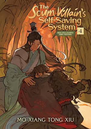
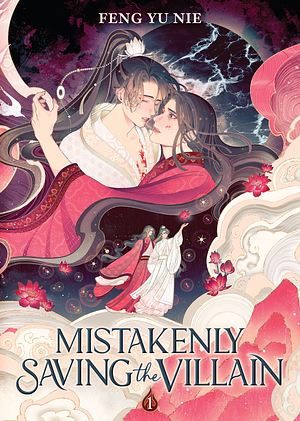
These covers are telling you really important things about settings, the central relationships (romances between men), that the books are in a series… and they also help to enforce the really strong rules danmei often seems to have about how the characters should be imagined. You know immediately how Shen Qingqiu “should” look according to the author’s imagination. You’ll find his character design varies astonishingly little across different translations (though Binghe varies a bit more, e.g. not always having the curly hair, his outfits are consistent).
The same is true of so many genres: you don’t need to guess for long to know the genres of the covers below:
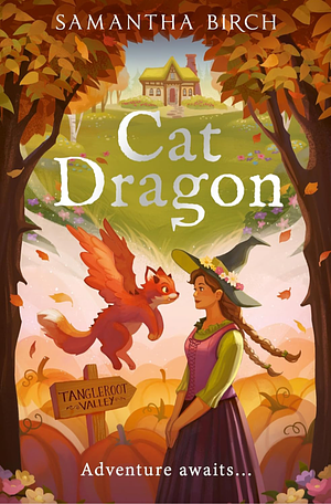
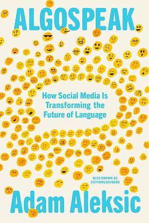

Respectively: romance, fantasy, non-fiction, sci-fi.
When something starts melding genres, covers can be a really big part of communicating that too. Here’s a series that I really loved, which melds a classic private eye kinda story with fantasy:
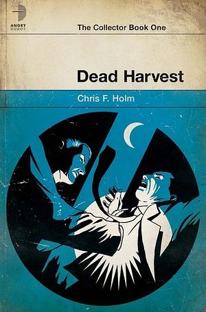
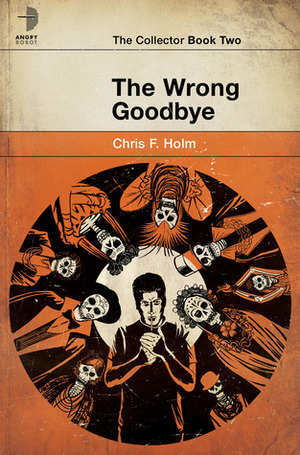
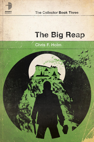
If you can, look how clever those are! Given the Raymond Chandler references, I’d bet there are covers of Raymond Chandler’s books that look just like this. But the images make it clear that there’s more going on too — I think these are such clever designs.
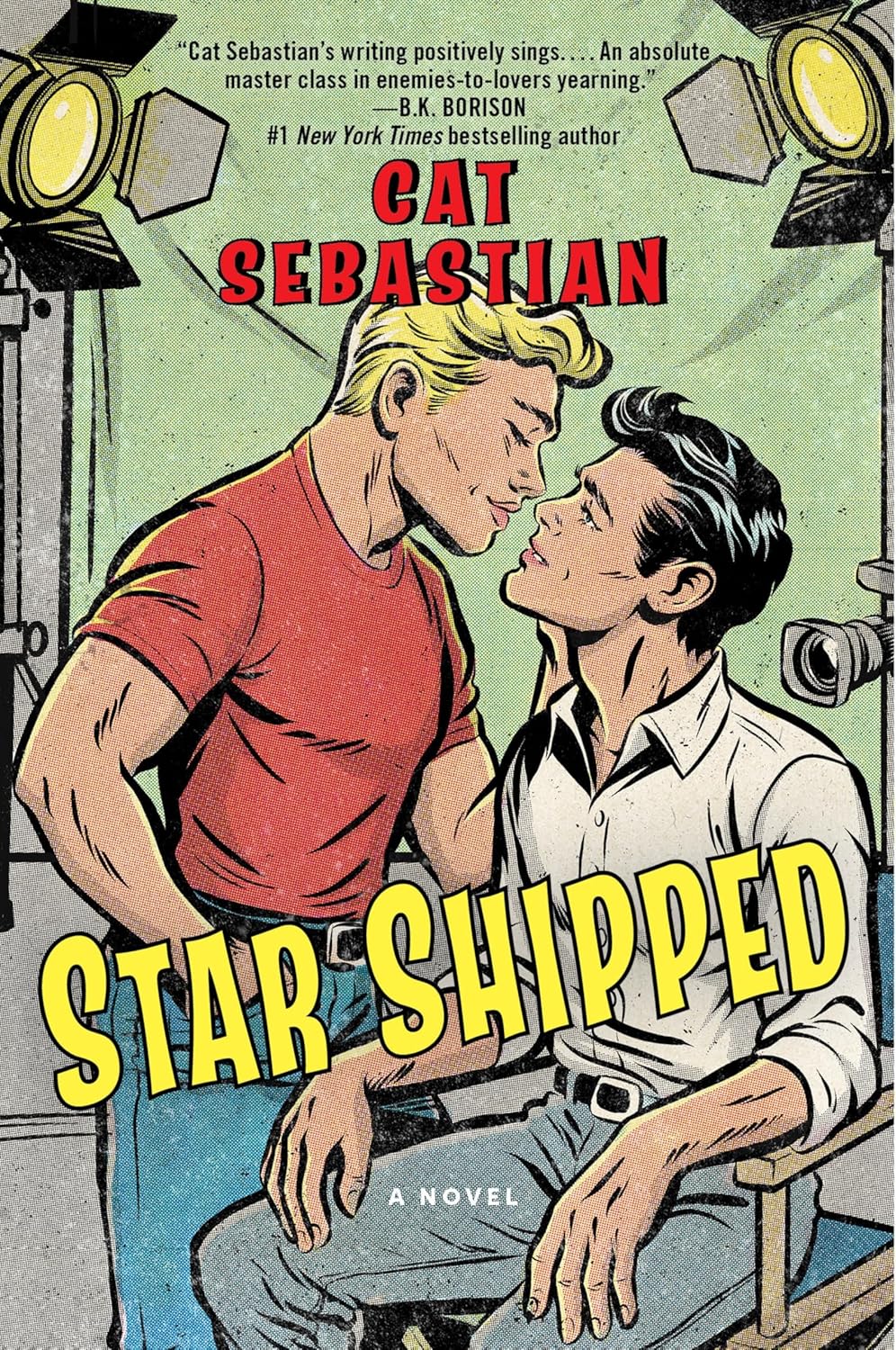
For another example, sometimes covers can be helpful to tell you what to expect for an author who writes several different genres. Compare these T. Kingfisher covers, some for fantasy novels, others for horror.
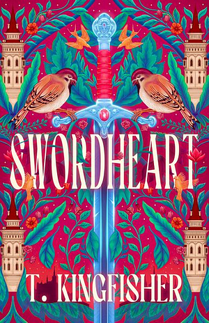
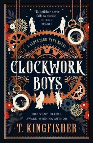
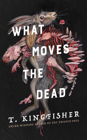
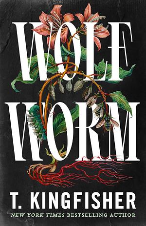
Did you have trouble telling which was which? Sure, the titles give a bit of a hint too, but sighted people are probably able to tell even before they look at the words.
Even covers with lower budgets, or which miss the mark in certain ways can give you a lot of info about what you’re getting into. I don’t love the covers below, but they still give you important info:
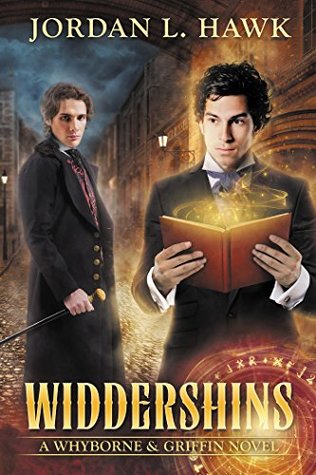
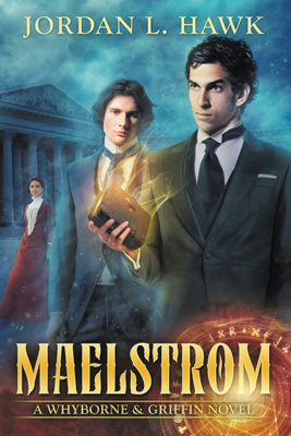

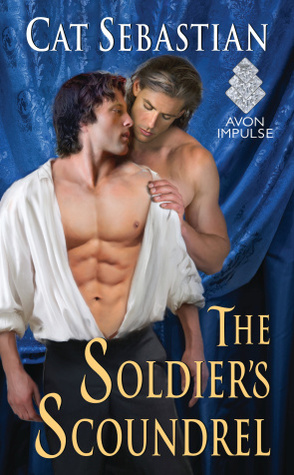
You can see the heroes of the Jordan L. Hawk series, and see that it is a series through the cohesive cover design. You can get the fantasy/horror vibes and an idea of the main pairing dynamic. From the Cat Sebastian covers, you can instantly tell it’s a romance and an idea at the pairings therein — though this is a little misleading in the case of Unmasked by the Marquess, one of the more unfortunate covers of Sebastian’s books. All the same, even with its flaws, it’s giving you important signals.
I didn’t even dig particularly deep for the examples here, or dig into the complex design principles behind many covers — this was an off-the-cuff quick post! The point is: covers are actually important, and cover artists can do an enormous amount for a book. Even on ebook stores, the cover is usually displayed, same on social sites like Goodreads and StoryGraph: unless you literally can’t see the covers (which of course is true of some!), there’s some degree of influence, even if it’s “oh, that has a self-published look” or “that’s a fantasy book”, etc — even when you may not be fully aware of it.
So in short, I think we should celebrate cover artists and designers, don’t discount their work! Sometimes the books don’t match up to the covers, and sometimes covers do the book a disservice — this will always be true. But covers have a valuable job to do, and books can find the right people through them.

What an incredibly thoughtful post! I’ve never really thought deeply about book covers and the role they play. I am often attracted to books because of their covers, so I know cover designs definitely influence me to an extent, but I’m also the kind of person who buys the cheapest edition of a book regardless of their cover simply because I have a budget and I want more books for my money! That doesn’t mean I don’t care about the covers though, just that I’m cheap! LOL! And I agree with you about having covers give information about the kind of story we’re getting, plus I love books in series or sets that have a cohesive design. It makes me want to collect them!
Haze @ The Book Haze recently posted…Top Ten Tuesday | Books Covers with Interesting Typography
I try not to get too obsessive about it but I definitely collect pretty covers sometimes, ahaha. I’ve been resisting the special editions of Heaven Official’s Blessing…
I LOVE covers and I do judge books by them! Lol. Well, not all the time, but a good cover certainly helps sell the book. I really love the British Library Crime series, the covers are so distinctive. These are great examples and what a fun discussion topic
Covers are super helpful in zeroing in on the genres you’re interested in, particularly in really crowded bookshops! I’ll often pick something up to check it out based on an interesting cover, even if it’s not a genre I usually go for, as well.
Ooh, I’m going to be looking into The Collector series- they look (and sound) awesome!
I remember loving the series sooo much!
Absolutely agree with this! Of course, don’t judge a book by the cover in terms of don’t assume book cover quality = book quality, but absolutely use the cover for what it’s for – figuring out whether a book is for you or not! And this is why it’s so bad when book covers are designed in a way that doesn’t match with the book – it’s all part of poor marketing that leads to the wrong people picking up a book and then being disappointed! Book cover design IS important and we should absolutely celebrate the incredible work that some of these designers do, even if we don’t base our decision to like a book or not entirely on the cover!
Keira @Keira’s Bookmark recently posted…February 2026 TBR
Exactly, yes! Book cover design doesn’t really tell us anything about the quality of the book, but it does steer the right readers to it (even just by having the author and title written on it clearly, at the very simplest).
Yes, British Library Crime Classics covers are so cool!
Emma @ Words And Peace recently posted…Book review: Moi Fadi, le frère volé
It’s a really well-designed aesthetic for the whole series, I love them.