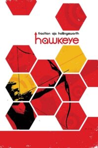
 Hawkeye: Rio Bravo, Matt Fraction, David Aja
I know that everyone thinks Matt Fraction’s Hawkeye run has been the best thing since sliced bread, and I wish I could feel it too. I can see objectively that it’s good — I like Aja’s art, I like the inclusion of Kate Bishop as Hawkeye, I like that Clint’s a doofus and I love the experimental storytelling like the issue from Pizza-Dog’s point of view and showing Clint’s sign language. Hell, I love the inclusion of Clint’s brother, the way Fraction re-introduces Clint’s deafness (which I think was originally a story in the 70s?).
But somehow it just doesn’t quite come together for me — possibly because there’s a lot of visual storytelling, and I am a dunce when it comes to visual skills. I can’t even imagine rotating a simple shape, or picture someone’s face in my non-existent mind’s eye, so even if I spoke American Sign Language (which I don’t and wouldn’t, since when I learn it I’ll learn British Sign Language) I wouldn’t be able to read Clint’s signs, and… the dialogue in a comic really helps to orientate me.
I still think this run on Hawkeye is fun, but I just don’t appreciate it in the way other people do, and I’m sure there are awesome parts I’m not even appreciating. I suppose that’s, in part, why I’m an unlikely comics fan. Still, I get some enjoyment out of it, and I do see why this run has been so popular!

Leave a Reply